Choosing paint colours for your home sounds simple until you’re standing in front of a wall of swatches. With hundreds of options and a lot of room for regret, it helps to have a clear process before you pick up a brush.
Whether you’re repainting a single room or refreshing the entire exterior, this guide walks you through how to choose paint colours that work for your space, your style, and Perth’s unique light and climate.
Start With the Feeling You Want
Before you look at a single colour, think about how you want the space to feel. Calm and restful? Bright and energising? Warm and cosy? This gives you a direction before you get overwhelmed by choices.
A few starting points worth considering:
- Bedrooms often benefit from soft, muted tones that promote rest
- Living areas tend to suit warmer neutrals that feel welcoming
- Kitchens and bathrooms can handle crisper, lighter shades that feel clean
- Home offices work well with grounded tones that aid focus without feeling heavy
Once you know the mood, narrowing down the palette becomes much easier.
Understand the Role of Natural Light
Light changes colour. This is one of the most important things to understand when choosing paint, and it catches a lot of homeowners off guard.
Perth receives some of the most intense natural light in Australia. That north-facing room flooded with morning sun will read very differently in the afternoon. A cool grey that looks sophisticated in a showroom can look almost blue on your south-facing wall.
The fix is simple: always test paint in your own space. Paint a large swatch (at least an A3 sheet) directly on the wall and observe it at different times of day. Do this before committing to anything.
Work With What’s Already in the Room
Paint doesn’t exist in isolation. Your flooring, furniture, cabinetry, and soft furnishings all affect how a wall colour reads.
Pull colours from something already in the room that you love. A rug, a couch, curtain fabric, even a piece of art can anchor your palette. From there, you’re choosing colours that complement rather than compete.
A simple rule: choose one dominant colour (walls), one secondary colour (larger furniture or cabinetry), and one accent (soft furnishings or features). This 60-30-10 approach keeps rooms feeling balanced without looking flat.
Know Your Undertones
Every paint colour has an undertone, even whites and neutrals. A white with pink undertones will clash with warm timber floors. A beige with green undertones can make a room feel sickly if paired with the wrong light.
The most common undertone families are warm (yellow, red, orange), cool (blue, green, purple), and neutral. When in doubt, pull towards the undertone of your fixed elements, which are things like tiles, stone, and flooring that you aren’t changing.
Consider Perth Home Styles and Local Colour Trends
Perth homes have their own character. From Federation cottages in inner suburbs to rendered brick homes in the outer suburbs and coastal properties with ocean views, the architecture itself can guide your palette.
Currently popular in Perth:
- Warm whites and off-whites for modern exteriors that hold up in the harsh sun
- Earthy tones like ochre, clay, and terracotta for rendered homes, influenced by WA’s landscape
- Deep greens and charcoals for feature walls and front doors
- Soft sage and dusty pinks for contemporary interiors
The key with exteriors in Perth is choosing colours that can handle UV exposure without fading. Lighter and mid-toned shades in quality exterior paint formulations tend to hold their colour better over time.
Don’t Skip the Finish
The sheen of a paint finish changes how a colour looks and how it performs. Flat and matte finishes absorb light and hide imperfections but are harder to clean. Satin and eggshell offer a soft sheen and are much more practical in high-traffic areas. Semi-gloss and gloss are best for trims, doors, and wet areas.
For most Perth homes, an eggshell or low-sheen finish on interior walls strikes the right balance between looks and durability.
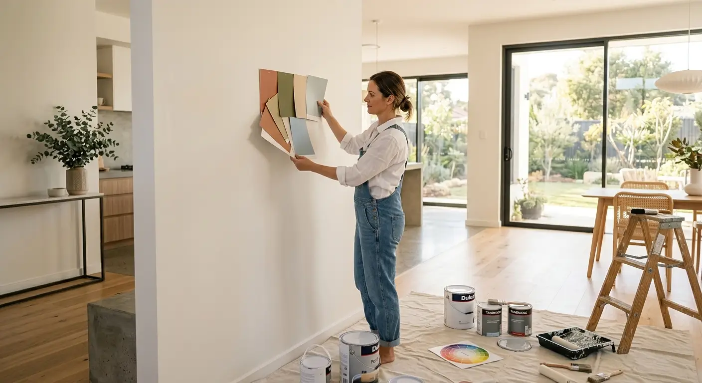
Test Before You Commit
Paint sample pots exist for a reason. Never choose a colour from a chip alone, and never choose from a chip under the fluorescent lighting of a hardware store.
Buy two or three sample pots, paint large test patches on the actual walls you’re painting, and live with them for a few days. Check them in morning light, afternoon light, and artificial evening light. What you see will tell you far more than any colour card.
When to Get Professional Colour Advice
Some projects benefit from an extra set of experienced eyes. If you’re choosing colours across multiple rooms, tackling an exterior repaint, or working with an awkward space, professional colour consulting can save you from costly mistakes.
At Auzz Painting Service, we offer colour consulting in Perth as part of our painting services. Our team understands how Perth’s light and architecture affects colour choices, and we can help you find a palette that works for your specific home. Get in touch on 0474 157 273 or at info@auzzpaintingservice.com.au.
A Quick Checklist Before You Paint
- Decide on the mood or feeling you want in the space
- Note the direction your room faces and how light moves through it
- Pull your palette from something already in the room
- Check undertones against your fixed elements
- Test sample pots on the actual wall before buying full tins
- Choose the right sheen for the room’s use